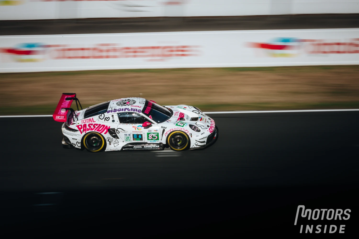
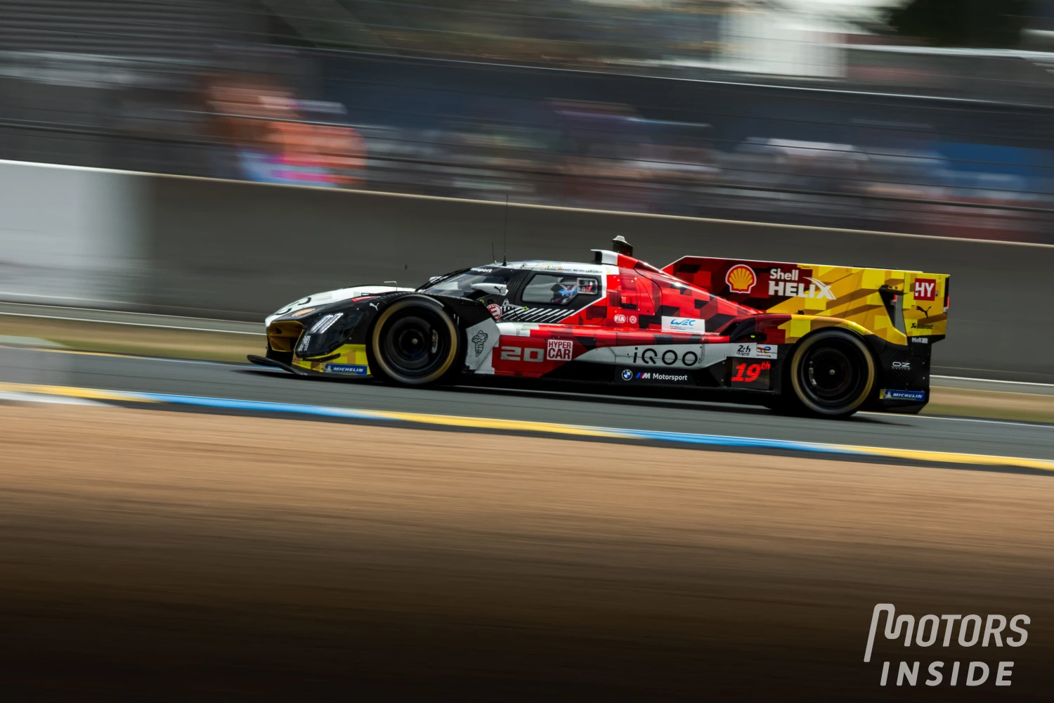
Delivered in 2021: the editors’ top and bottom stories
The editors of Motors Inside cut to the chase with their top 3 and flop 3 2021 liveries.
No more secrets! The start of winter testing will allow everyone to admire the new cars up close. So far, we’ve had the livery show: staged unveilings, but often hiding the back of the car, the core of the new regulation changes.
Motors Inside takes a risk anyway, with its top and flop to determine the trio of satisfactions and disappointments of the 2021 race cars.
To choose, five editors, with a scale from 1st to 3rd place: 25, 18 and 15 points for the top 3, as well as the bottom 3.
Top 3 of the editorial team: Alpine praised
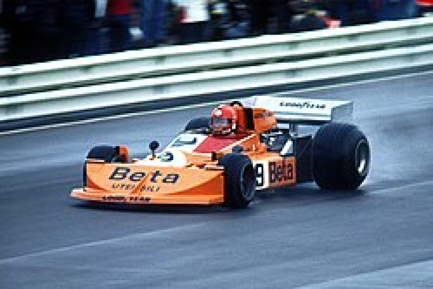
1. Alpine 118 pts
2. Aston Martin 54 pts
3. Alfa Romeo 48 pts
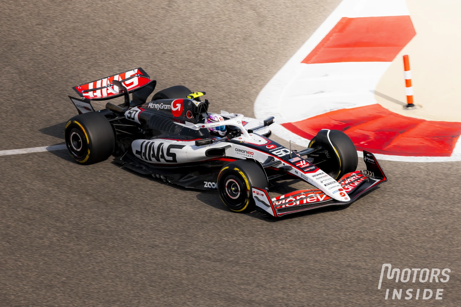
Also mentioned: Haas, 40 pts. AlphaTauri 30 pts.
Not mentioned: Mercedes, Red Bull, McLaren, Ferrari, Williams.

Top 3 of the editorial team: Williams also highly praised
1. Williams 118 points
2. Ferrari 76 pts
3. Haas & Mercedes tied at 33 points
Also mentioned: Red Bull 15 pts, Aston Martin 15 pts.
Not mentioned: McLaren, Alpine, AlphaTauri, Alfa Romeo

Matthieu Piccon:
My top 3:
1. Haas: the purpose of a livery is to give a visual identity to a team. The ideal is to be recognized at first glance, which is a sign of notoriety. In this sense, the new visual identity of Haas is a masterstroke!
The new title sponsor is the company of the Russian Nikita Mazepin and it must be acknowledged that we cannot go wrong with this massive support! It is well played especially since the driver is not allowed to display his colors on himself but nothing prohibits (for now) on the single-seater.
2. Alpine: Once again, a livery is intended to showcase a brand. Clearly, the French blue has been associated with the brand since its origins and it would have been very surprising if another color had been adopted. The integration of the giant logo is also harmonious.
3. AlphaTauri: there, it’s just a personal taste. I find it very elegant, with a pleasant mix of colors to the eye.
My flop 3:
1. Williams: by far the winner! Frankly, one wonders if it’s an “artificial” intelligence that did the job. It reminds me of video games in the 1990s when games didn’t necessarily have official licenses: we created somewhat fanciful creations with a futuristic purpose. In this case, one might think that pixels have been stuck.
After the only interest it presents is to mask the abysmal void in terms of sponsors to display. The worst part is that they tried to justify this “choice” by the team’s history.
2. Mercedes: the manufacturer is almost betting not to display its own logo in favor of one of its subsidiaries and its new co-shareholder. But the AMG block is too much of a break from the rest of the livery to be pleasing. Whether the team persists in its choice to abandon its historical colors for marketing reasons and to align with its star driver is also questionable.
3. Red Bull: only because the RB17 is just a copy/paste of the cars from the last five seasons.
Alexandre Lepère
My top 3:
1. Alpine: a harmonious tricolor blend, which identifies both France and the United Kingdom, the two origins of the team. The royal blue is a success, a choice abandoned in recent years in F1… let’s be proud of this “so french” livery!
2. Aston Martin: a “striking” and traditional green for the British manufacturer. The DNA is restored, especially since the pink of the BWT sponsor is well integrated… on the car (we won’t talk about the suits). A refreshing livery, full green makes its comeback after Jaguar in the early 2000s.
3. Alfa Romeo: still about identity, Alfa Romeo keeps and improves its livery with dark red on the sidepods and halo, and white on the rest of the car. The opposite of last year and a promising new vintage, will it perform as well on track?
My flop 3:
1. Williams: Help! The first livery of Dorilton Capital is a failure. No chemistry between the navy blue at the back, the light blue in the middle, and the white at the front. The thin white stripes near the engine don’t look good either. The new owner talks about being inspired by Williams’ liveries from the late 80s to early 90s. But where is the connection?
2. Haas: from a black-white-red trio… to the colors of the Russian flag, the change is too brutal. The classic look of Haas since 2016 (which was not always successful) disappears without warning. Or should we talk about the first livery of the new Uralkali team. On board camera, the car may resemble a BMW Sauber from the late 2000s. A too sober single-seater.
3. Ferrari: the unfortunate surprise of early 2021: green stripes on the traditional red of the Scuderia Ferrari. What a waste! Especially since the burgundy-red light red combination is promising. Let’s campaign for a switch from green to white for the Mission Winnow sponsorship, which at least has the merit of sparking discussion.
Nicolas Lherm:
My top 3:
Alpine: Renault F1 and its swept past! The visuals are superb, the symbol powerful. The tricolor colors unite Viry-Chatillon and Enstone on a livery dominated by a powerful royal blue. The matte trend is out, replaced by vibrant colors. Perhaps a bit chauvinistic, I endorse the French livery.
2. Aston Martin: I imagined a dull single-seater, littered with pink colors linked to the sponsor BWT. This is not the case. Aston Martin has provided us with a superb green highlighted by pink stitching. A nice surprise!
3. AlphaTauri: Graphics, a kind of dark teal that contrasts with the white, it takes no less to delight my eyes. Continuing from last year, AlphaTauri maintains its no-frills design!
My flop 3:
1. Ferrari: Our Italian friends’ 2021 livery is the ugliest on the grid. Light red, dark red, yellow, black, and green. Too many colors, too much mess, no coherence, and that green logo!
What to say? A marketing success no doubt since the automotive world has only been talking about this infamy since its arrival, but a terrible aesthetic mistake.
2. Williams: the era of the magnificent Williams in Martini colors seems far away. Dignifiedly emerged from a 2000s arcade game, this livery is quite dull. No coherence, no signature, and too few sponsors to make it a livery worthy of an F1.
3. Haas: The car reminds me, for the connoisseurs, of the single-seater car of the Russian players in the online game Trackmania. While the colors match quite well, all on a white background with pleasant designs, I am outraged by this choice. John Fitzgerald Kennedy must be turning in his grave seeing an American team, funded by a Russian oligarch, wearing Soviet colors.
Having nothing to reproach the Russians for, I would have liked to see this livery with one half in German colors. That would have been original, no doubt nice, psychologically healthier for young Mick Schumacher, and above all less revealing of the Mazepin family’s wealth grip on the team.
Guillaume Pinquet:
My top 3:
Alpine: the change with Renault is radical, I was afraid that black would be (as with Renault) a little too dominant but finally no: we find the iconic Alpine blue and a superb livery in French colors. Cock-a-doodle-doo!
2. Alfa Romeo: liveries with a lot of white in F1 are coming back into fashion, and it works very well with the Alfa Romeo, which also keeps its beautiful red. The presence of white allows for better visibility of the logo on the engine cover. An effective livery.
3. Haas: if we overlook the “conflict of interest” between the American team and its Russian investor, this livery works very well, with the blue and red following the airflow on the car and the traditional large Haas logo.
My flop 3:
1. Williams: a poorly done gradient of blue with stripes, uninteresting hints of orange, no sponsors, the Williams logo barely visible on the engine cover… A disaster.
2. Ferrari: If the Ferrari gradient is not as poor as Williams’, it is still not a success. The drivers’ numbers’ calligraphy is already passable, but it’s especially the bright green Mission Winnow logo that ultimately makes this livery one of the worst on the 2021 grid.
3 Aston Martin: this choice may seem surprising because it’s a livery that is quite popular in general. I admit I was a bit disappointed. I was expecting a darker green, more “Aston Martin” in the end, a bit like the Endurance type, with some touches of yellow.
Elijah Kingo
My top 3:
1. Alpine: the team’s very first livery is an obvious aesthetic success. The new blue color marks a radical change from Renault’s traditional yellow and black. With this predominant light blue on the car, a bright red is added to the rear as a very successful tribute to the French flag.
2. Aston Martin: The uniform and relatively sober green on the entire new AMR21 is very effective. The only significant downside is the touch of pink for BWT, which is still present and takes away some potential from an otherwise very pleasant livery.
3. Alfa Romeo: not a lot of changes for the C41 which mainly keeps the same design codes as last year by reversing the colors, the brand’s logo changing from white to red on the single-seater. The livery is in line with what the team has been offering since its return to Formula 1 in 2018.
My flop 3:
1. Williams: Worst car on the grid in terms of performance in recent years, the same goes for the aesthetics of this brand new FW43B. The different shades of blue on the car creating a shark gill effect do not work at all.
2. Ferrari: not a fan at all of the different red shade at the back of the car reminiscent of the special livery from the 2020 Tuscan Grand Prix at Mugello. Not very consistent and the final result is quite strange. The green logo on a red background is a disaster.
3. Mercedes: The W12 doesn’t change a lot from the successful W11 of 2020. But the striking difference in grey shade at the back doesn’t particularly excite me.
Find here all the presentations of the liveries of the 2021 season!